Showing posts with label kids. Show all posts
Wednesday, January 30, 2013
Bring it On!
When I saw the CASology challenge this week (game), I knew I had the perfect set - Boys Basics: Game On by Papertrey Ink, which my sweet sister bought for me at Christmas. I paired this up with the sketch challenge over at Retro Sketches.
Thursday, April 12, 2012
Fully Rely on God
I purchased the Hoppy Frogs stamp set from Clear Dollar stamps specifically so I could make a card with the acronym FROG, which of course means "fully rely on God". It's perfect for our card club for those times when we need a card for the kids. I am entering this one also in the Less is More color challenge: three shades of green. My strip of grass wasn't quite long enough to reach across the entire width of the cardstock, and I did try to cut the cardstock down to fit the grass, but the design I had just didn't work with a smaller base. Instead, I added an extra bit of grass at the end, as you can tell by the seam. It's got a bit more going on as far as layers are concerned, but since this is not a one layer challenge I hope it will be OK to qualify. If not, it's still a keeper and we'll be making more at our get-together next week!
Thanks for looking!
-Brenda
Thanks for looking!
-Brenda
Wednesday, April 11, 2012
Think About It
My card club needs to make cards for the kids during VBS this summer. I have the card prepared for the 5th graders and under, but I wanted something edgy and "cool" for the middle and high school kids. I used the three shades of green watercolor pencils so I could enter this card in the Less is More color challenge. It has absolutely no layers - I think that's a first for me. I teared off the edge of the card and inked it in green. The stamp comes from Clear Dollar stamps.
Thanks for looking!
-Brenda
Thanks for looking!
-Brenda
Sunday, January 15, 2012
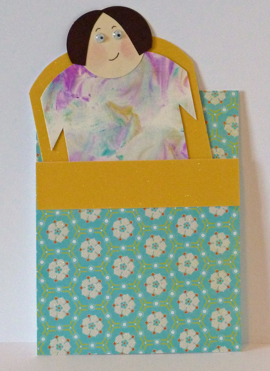
Pocket Sleeper
My daughter's birthday is coming up soon, and she is having a slumber party with a few of her friends. I made this pocket card using the colors that match up with the Color Throwdown challenge. It's suppose to look like a girl in a sleeping bag, and I hope it does. The tie-die paper is a shaving cream and ink technique I was experimenting with. The party info is on the back of the "sleeping" girl.
Thanks for looking!
-Brenda
Saturday, July 23, 2011
Mikala Ann
Another scorcher today, and I find I'm still in a pink mood, hence today's card, thanks to the Cutting Cafe. The image is Mikala Ann, from the Elisha Jean and Friends set. I printed out the images three times; once for the main image, then a patterned piece of paper for the dress, then a plain sheet of white paper for the balloon and the bow around her waist.
Getting the skin tone was tricky since I did not have a good color - I had to combine several colors and blended them together to get the shade I wanted. I tried to follow the artist's rule of three, usingthree ribbon loops and the three mini brads. I adhered the balloon with pop dots for more dimension, which is difficult to see in the picture. If you look, you can see the black outline of the balloon on the main image under the colored balloon.
Thanks for looking!
-Brenda
Getting the skin tone was tricky since I did not have a good color - I had to combine several colors and blended them together to get the shade I wanted. I tried to follow the artist's rule of three, usingthree ribbon loops and the three mini brads. I adhered the balloon with pop dots for more dimension, which is difficult to see in the picture. If you look, you can see the black outline of the balloon on the main image under the colored balloon.
Thanks for looking!
-Brenda
Thursday, June 30, 2011
VBS Cards
Just recently the ladies from my church's card ministry finished up the last of the VBS cards. What a project that turned out to be! They were really committed, though, and did great work with the production line. We made 150 cards which will be distributed to the teachers at the end of VBS. The theme is beach, hence the beachy card. I'm really getting use out of my bubble border punch! I tried to keep the card simple, but fun. We ripped paper for the sand, and inked the edges of the verse to look like water. The inside of the card has a strip of blue paper cut to look like waves. I used the same technique for my Huggable card. The verse from John 14:6 is the theme verse for the week.
Thanks for looking!
-Brenda
Thanks for looking!
-Brenda
Monday, June 27, 2011
You're So Square
Mojo Monday is a great blog and I just recently started playing along with their weekly challenges. I used this week's sketch to make a boy themed card for Card Cupids. I'm not entirely thrilled with the way this one turned out - but I am submitting it anyway. I spent a really long time fussing over the coloring of the dog - shading, re-shading, adding colors on top of other colors, even blending with my water brush. Perhaps I fussed too much. Oh, well. I do love this dog stamp. I've used it many times before, but I just had to use it again for this project - it's the perfect image for a boy.Paper is from the Complete Boy stack by My Mind's Eye.
My daughter has been a great design helper. As I was working on the dog and fussing over which colors to use, she said, "You should use green for the collar." And go figure, I had just at that moment decided to use green! Hmmm, is it genetic, or just plain creepy?
Card is entered in:
mojo197
card cupids
Thanks for looking!
-Brenda
My daughter has been a great design helper. As I was working on the dog and fussing over which colors to use, she said, "You should use green for the collar." And go figure, I had just at that moment decided to use green! Hmmm, is it genetic, or just plain creepy?
Card is entered in:
mojo197
card cupids
Thanks for looking!
-Brenda
Subscribe to:
Posts (Atom)